Print/Illustration
2013
Individual Project
About the Project
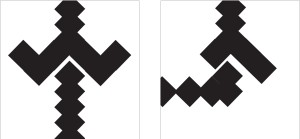
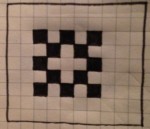
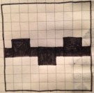
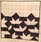
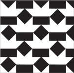
Gestalt and other visual design principles inspired this series of compositions, which are, as you can see, made up of nothing more than squares ordered in white space, sometimes uniform (i.e. black 1″x1″), other times varying in dimensions, color, and rotation. And yet they’re interesting, right? This is because each composition is designed to resonate with the other in its pair: symmetrical with asymmetrical, static with rhythmic, etc. Together, two compositions in “dialogue” with one another can communicate meaning with more depth than what is achieved by any of their individual parts. For the first word pair, panels 1 and 2– symmetrical and asymmetrical– I was required to work with uniform, black squares, then adding color to panels 3 and 4 to emphasize more greatly the distinction between the two compositions. Panels 5 and 6 depict static and rhythmic, left and right respectively. Finally, panel 7 is a reversible figure/ground composition; in other words, depending on how you look at it, you may see a white figure, like two fence tops facing one another, or a black figure, two pot-like shapes, one right side up, the other inverted. Check it out for yourself!
Process
Symmetrical and Assymetrical
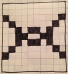
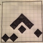
(Thumbnails done with Sharpie fine-point pen.)
These sketched thumbnails should look somewhat familiar to you, especially the seconds; they are the inspiration for the symmetrical and asymmetrical compositions I polished using Adobe Illustrator. Before opening Illustrator, I was required to produce 30 thumbnails, 5 for each of the 6 design principles the class was given as point to begin at. The thumbnail on the right may strongly resemble the final asymmetrical composition, but it took a great deal of time to make it look just right. The final symmetrical composition, on the other hand, required much, much revision. Here’s a quick look at the steps I took from thumbnail to Illustrator composition.
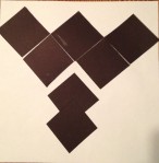
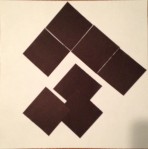
(Compositions made of white and black paper.)
In class, I was asked to choose the two strongest thumbnails I had drawn for one particular word pair and reproduce these designs using a sheet of white paper and black paper squares of various sizes. The compositions above were my attempt to bring some homogeneity to my strongest thumbnails for the symmetrical/asymmetrical word pair. As you can see, both of the designs underwent alterations from thumbnail to larger paper-on-paper composition, the symmetrical having changed more radically. At this point in the process, there is commonality between the two designs, namely the arrowhead appearing in the center of both.
(Paper compositions reproduced on Adobe Illustrator.)
When the paper compositions were reproduced on Illustrator, getting the squares to touch, perfectly aligned, was extremely difficult, maddening at times. In other words, the compositions wouldn’t translate so it was back to the drawing board. Also, some minor changes were made (i.e. extending the column of diamonds in each composition).
(Compositions revised on Illustrator.)
The first thing you probably noticed is that white space appears between the squares forming the arrowheads. As I stated in the previous section, it was difficult to align the rotated squares, or diamonds, perfectly so that all their corners touched with no white space; therefore, I made the executive decision to space these diamonds apart without breaking up the arrowhead. I think the arrowhead is emphasized more greatly now with the inclusion of white space, since all the other squares overlap, making it hard to tell where one ends and the other begins and forming one cohesive object. It is unmistakable that the arrowhead is symmetrical along the vertical axis, since all the diamonds are equidistant from center to center with edges that make lines of equal angle, but inverse direction. Though the arrowhead has been dismantled on the asymmetrical side, it is clear that the origin or inspiration of this figure is the complete arrowhead from the symmetrical.
Next, I added some color to this pair of compositions to intensify the minute details that make them different. For instance, in the symmetrical composition the red diamonds align perfectly in the center of the 6.5″x6.5″ template. Conversely, the red diamonds in the asymmetrical do not match up. Neither is exactly 3.25″ from the sides of the template; in fact both of these red squares favor the left of the asymmetrical composition. If you trace a line from the top column of diamonds, you will find that the bottom has shifted slightly to the left. Due to these changes, the composition is no longer symmetrical.
Static and Rhythmic
(Thumbnails done with Sharpie fine-point pen.)
Originally, both of these thumbnails were classified as “rhythmic” in my sketch book, but after discussing with a classmate what messages they communicate to the viewer it was decided that the composition on the left more closely represents the idea of “static.” Though the left-hand composition has repeating elements–for instance, the W’s of squares that give the figure its four sides– it fails to communicate any regular motion or pattern and so it is not rhythmic.
(Thumbnails reproduced on Illustrator.)
Reproducing the static composition on Illustrator was not very difficult, and it required only light revision to communicate its meaning effectively to the viewer. In the thumbnail, I was working with uniform squares; while translating my work onto the computer screen, however, I elected to change the size of the four interior squares. What did this do? The W’s I referred to in the section above are now less striking and discernible, with smaller squares forming their points. This revision does away with the idea of repeating elements, which may have stirred up confusion among viewers as to whether the composition is communicating static or rhythmic.
The rhythmic composition underwent many changes. I think the original communicated the idea of rhythmic somewhat effectively, but it wasn’t strong enough. The overlapping squares formed one cohesive figure and muted the regular motion I was trying to capture. Consequently, I injected some white space into this composition. The figure–a large square up top and a small square at the bottom right-hand corner–appears four times in this composition, but changes slightly between occurrences, indicating motion.
(Compositions revised on Illustrator.)
The static composition had already undergone effective revision by this point in the process, as I mentioned before, and we discussed in the section directly above the changes I made to the rhythmic composition to reinforce its message of rhythm, using the thumbnail as a rough guide. In the final step of this process, I polished off the right-hand composition by aligning its baseline with the center row of the left-hand. This revision lends the pair of compositions a greater sense of visual unity.
Reversible Figure/Ground
(Thumbnail done with Sharpie fine-point pen.)
This is the thumbnail I originally chose to develop into a reversible figure/ground composition. I thought the pattern was engaging, asking the viewer to look closely at the layout of white and black space. The black figures, squares of various sizes and rotations, actually frame distinct figures in the white space, namely crowns. At this early stage, however, the pattern is rough and, as you can see, the white space is not uniform, sometimes forming figures other than crowns.
(Thumbnail reproduced and revised on Illustrator.)
I was able to format the pattern more clearly on Illustrator, and the white space became uniform. Between the black squares, there are many uniform crowns. Unfortunately, the crown are too striking and prevent the black space from communicating any figure of its own; in other words, the composition is not reversible. If the white space is to viewed as the ground, the part holding the figure, the black space must supply the figure, but it doesn’t.
(Thumbnail done with Sharpie fine-point pen.)
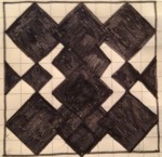
I went back to my sketch book and chose another thumbnail to develop. This thumbnail seemed to be a great candidate for revision; it features four overlapping diamonds that attract the viewer’s gaze to the black space as figure and its white space is equally capable of supplying figure. Look, for instance, at the lightning bolts immediately to either side of the overlapping diamonds. Interesting, right?
(Thumbnail reproduced and revised on Illustrator.)
In revising this composition on Illustrator, I wished to grant both the white space and the black the ability to function as either figure or ground, depending on how the viewer approached them. The black space forms a very distinct figure, which can be thought of as two vases, one right-side up, the other inverted. I’ll admit, the white space may still present a challenge to the viewer searching for reversibility; it is, however, more effective than my original idea, when the white space could only function as figure, the black only as ground. What do you see in the white space here? Anything? I can see two areas shaped like a fence with pointed stakes, rotated 90 degrees.


